October 28, 2011

What's In A Subway Sign? A New Font

In a break from their 45-year old master plan, the New York City subway system has introduced a new font to their signage.  At stations in and around the World Trade Center site, they have used Gotham instead of Helevetica to direct passengers to the entrance of the 9/11 Memorial.  The reason is that Gotham is the font of the memorial's trademarked design.

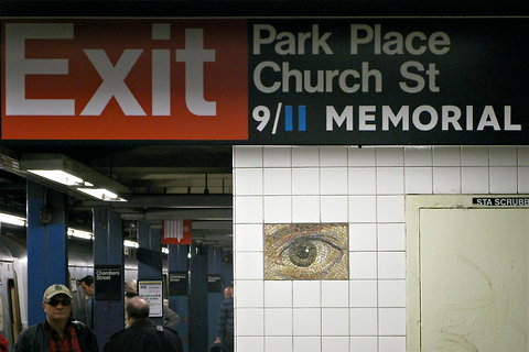
It is rather surprising change given how Helvetica has become a trademark of the system itself.  But the TIMES City Blog reports the MTA says this is actually just a temporary move.  The signs to the memorial are there because it currently has one controlled entrance (due to continuing construction at the site) and this is to guide thousands of visitors to that area in a clear, visually arresting way.